VALLEY OF THE DEER
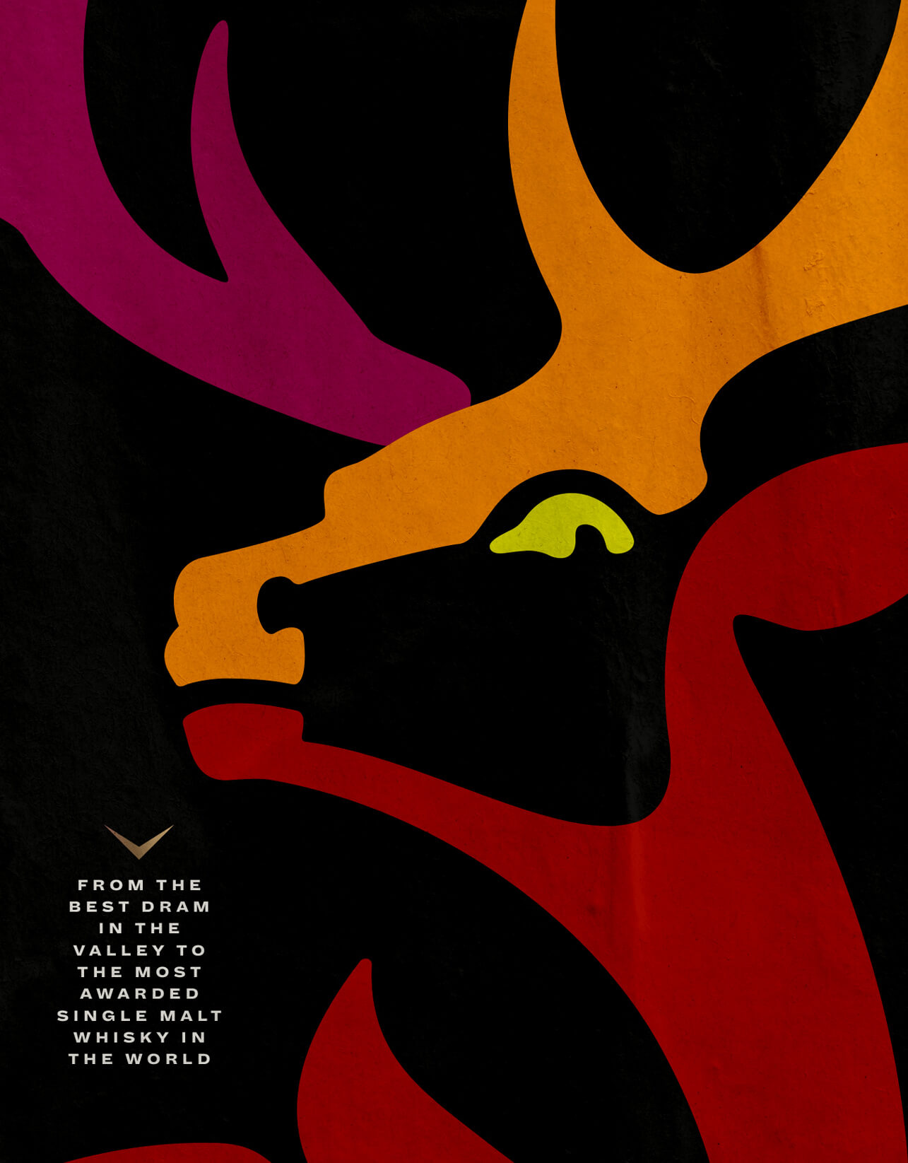
The newly shaped Glenfiddich master range of traditional malts needed a fresh visual language to match their new holistic DNA. To get across the sense of authenticity and elegance that went into every malt, bold yet traditional graphical approach was discovered.
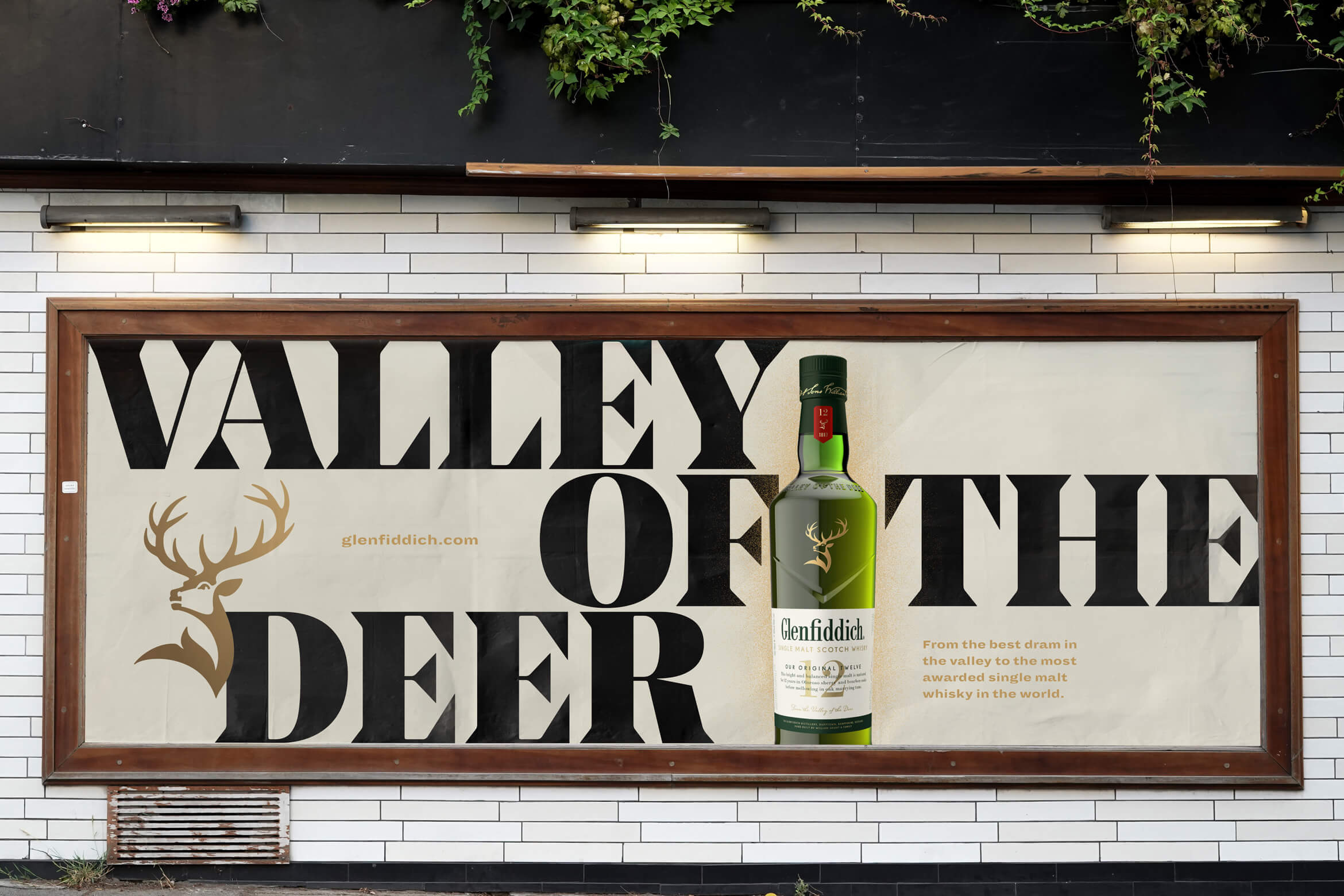
To reflect this visual direction an unapologetically expressive typeface was selected. It speaks with clarity and confidence, but the point isn’t simply to shout. Its strong will is tempered by a graceful discipline, like the Glenfiddich brand. The typeface's geometry reflects one of the new brand asset—the chevron and adds a certain fierceness to the usual elegance of the genre, without detracting from its poise and finesse.
+ VISUAL LANGUAGE
+ CAMPAIGN IDENTITY
+ GRAPHIC DESIGN
+ TYPOGRAPHY
DESIGNED AT
PURPLE CREATIVE

The range has been given a chiseled ‘V’ on the bottle to reflect Glenfiddich's ‘Valley of the Deer’ statement.


